When looking at magazines and online, it’s the brightly colored or dramatic rooms and accessories that grab the eye. These photos intend to make readers pause and take notice. This makes it hard not to think, “Should I be bolder and add more color to my home?”
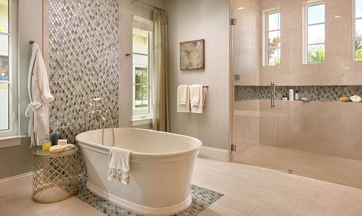
Neutral color palettes are equally as stunning as bright, colorful ones. These tones can highlight art, furniture pieces, and even views outside by acting as the perfect backdrop. When it comes to neutral colors, the key is to diversify your selections while keeping a related palette throughout open spaces.

Beige Has Personality
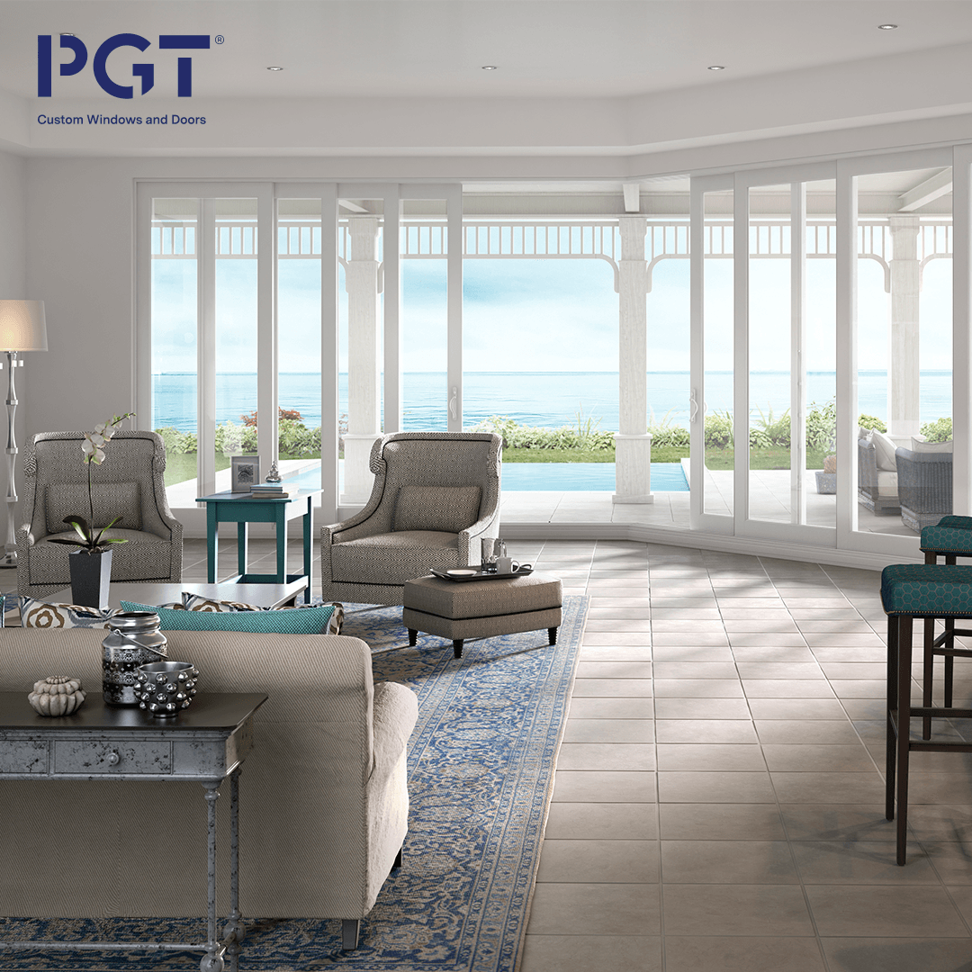
To find the right color for a room, take a look around (both inside and out). Does the view outside grab your attention? Is there a fireplace that is a focal point of your living room? Knowing where the eye wants to go automatically can help you select the right color to accentuate the star of the space. If the view outside is taking center stage, consider starting with neutral-colored draperies that would pull some of those colors indoors. Then, use those window treatments as paint color inspiration. Look for paint swatches that are few shades darker and few tints lighter. Even though you will only use one or two of those colors on the walls, keep the paint swatches. They can assist you in finding accessories and furniture that will play well with your beige room. Behr shares a beautiful inspiration board of beiges to help homeowners see where they can draw inspiration to select the perfect colors.
QUICK TIP
In the field of design, every color has what are called tints and shades. A tint of a basic color is a lighter version of that color, and a shade is a darker version. Tone is a general term to describe the lightness or darkness (tint or shade) of a basic color.
Pattern Is Not Required to Make a Statement
A neutral palette can have a wow moment. Inspired by nature, houseplants, or ocean views, whispers of colors can be just as breathtaking as a bold patterned accent wall. First, determine where you find inspiration. Is your backyard a gardener’s oasis, do you have scenic water views, or perhaps you have a collection of indoor plants. Select neutral versions of pinks, purples, yellows, blues, or greens to accentuate what you love. These colors can make appearances on your walls, in your furniture, and throughout your accessories.
QUICK TIP
You can take a color swatch or an actual item (for example, a throw pillow, painting or vase) to your local paint store. They can then help you find lighter tints of the perfect shade to paint your walls. This creates a custom look as it pulls everything together in your living space.


Multiple Tones of a Single Color Can Create a Cohesive Look
Whether a home has an open concept or a more traditional layout, selecting a cohesive color palette can allow you to be creative in each area of your home, while still having a pulled-together look. Using the color palette below for inspiration, one room could emphasize the grey and silver tones while another could include a vintage black table. The natural wood tones can repeat in picture frames and furniture legs that rest on rugs with the deeper shades. To find color palette ideas, look online, and in magazines.
QUICK TIP
Better Homes & Gardens created a beautiful sea glass green palette that is perfect for a coastal home. Consider painting the lighter tints in hallways or as cabinet colors, then one of the darker shades as an accent wall, trim color, or even on the ceiling.
Playing with neutral colors is exciting and can create an impressive home design. The key is to keep things in the same neutral family, and instead of adding entirely new colors from the color wheel, consider adding tints and shades of a single color to create your custom neutral palette.